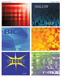
These pieces explore how various imagery, color, and typography can be used together to evoke a particular feeling or expression. Each makes use of contrasting or complimentary colors and simple graphics to show representations of a set of opposite words. (From top left: light/dark, shallow/deep, big/small, blurred/sharp, strong/weak, and up/down)
|


